Change the style of an element
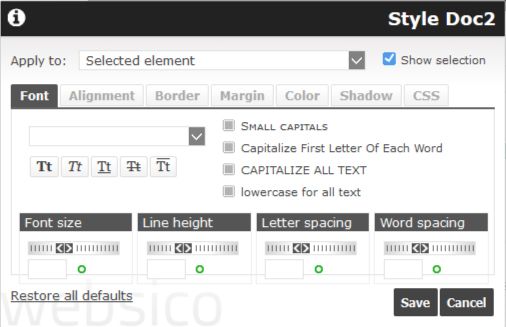
This feature allows you to act on the fonts, alignment, borders, margins, colors, shadows and CSS code, either for the selected element or for all elements sharing its named style if it has one.
Access the style

All element popups have a style selector and a button to modify style properties, which will be applied to the selected style.
Some properties may not appear in the settings where they are inapplicable to the selected element. Some properties applied to a block (especially settings of text) are transmitted to elements in the block.
The settings for the local style show and allow you to act on specific settings for this element, overloading those of any associated named style.
The settings for a named style show and allow you to act with the settings in this style.
Apply to
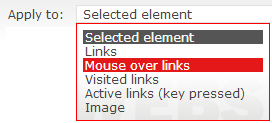
The settings can be applied to the links or subparts of the element (Ex: submenus for a menu, label for input element etc.). The setting of is done separately and successively (remember to record each time) for each link state (general, mouseover...) or subpart.
Restore default settings
This function deletes all the settings according with the context:
- Named style: applies only to the style without affecting the local settings of the selected item
- Selected element: applies to the item including the links and subparts it may contain
- Links in general: applies to all links of the item, including all their states
- Links in each state: applies only to links for the chosen state
- Subpart: applies only to the chosen subpart
Selection rectangle

To make easier the appreciation of the actual appearance it is possible to hide the rectangle surrounding the selected element.
Fonts
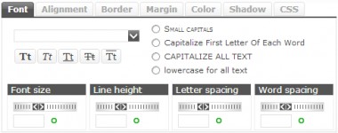
These settings apply to all text in the selected item. The different sizes (size, spacing etc.) relate to those of the element that contains it. For example a title with a font size of 2 will have their text 2 times larger than the page or any block that contains it.
Alignment
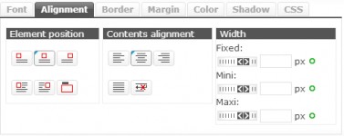
The absolute width (fixed) is reserved for blocks or raw texts. To give a fixed width to an element or a page, you must encapsulate it in a block for which you will set the width. This width is internal, it does not include margins and borders.
Min and max width are also settable.
Borders
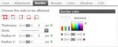
The borders of the four sides can receive settings individually for thickness, line type and color.
Corners can be individually rounded by setting the radius values.
Margins
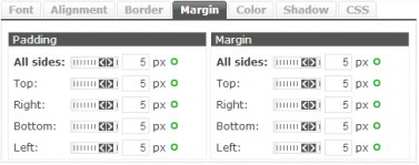
Setting padding and margin using the wheel or by direct input of the value. The padding is within the borders, the margin is outside them.
Negative margins may be set only by typing the value in the input field.
The padding makes selection and manipulation of an element easy. To better grasp an item, it can be temporarily given padding and remove them after handling.
Colors
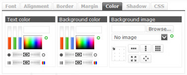
The color choice is made by direct registration of the color code, by using the mouse to set the level of each component (red, green, blue) or by moving into the "color map"; colors already used appear in the form of a selectable palette.
The scroll wheels let you adjust the brightness and the saturation.
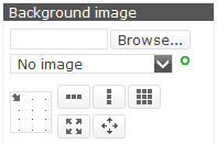
Importing a background image is made with the browse button.
The dropdown menu allows you to reuse an existing background image.
It can be repeated horizontally and/or vertically, positionned and stretched in one or in both directions to cover the background of the element.
Shadowing
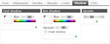
The shadows settings can be made by scroll wheels and color map or by typing the property in the text input. For multiple shadows it must be typed directly in the input.
Opacity setting applies to the element.
CSS
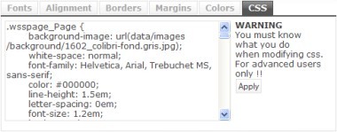
To edit the CSS code if necessary.
Sharable named style
A named style is a set of appearance settings that has a name and can be shared by elements of the same type.
Be careful not to confuse this with model that makes everything the same - the content and appearance.
Create and apply a style
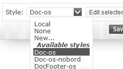
Styles can be modified from element popups:
To create a style, then from the "Style" dropdown list select "New ..." and save the new style with the chosen name. All current settings of the element are saved in the new style.
To apply a registered style to the selected item choose one of the applicable styles in the dropdown list.
To modify an existing style click "Edit selected style". When an element has a named style, this one is selected by default; to modify the local style, select style "Local".
Manage styles
The main toolbar has a button to open a popup that allows to destroy or rename any style, draft or public.
Remarks
A style is only applied to similar components, for example, the style of a block cannot be applied to a rich text.
If the style is assigned to a block, the settings of the elements encapsulated in this block are not registered in that style.
A style can be erased by restoring all the default settings.
Use named styles wherever it is possible and reasonable, it is more powerful for you and better for bandwidth. A minimum requirement would be to make a style if it must be used more than one item or one item in a model.


