Responsive layout
Page & System grid
The page is composed of any number of elements, it occupies the full width of the browser window. A system grid for positioning elements is built automatically during the construction of the page.
A system cell is a cell of that grid.
Moving an element
An element is movable anywhere on the page, on any border of element. Landing areas are visualized by a blue or red bar that appears under the cursor.
Creating a new cell
A new cell is created by drag and drop an element to a red target.
For example, one way to put a footer at the bottom of the screen is to drag the desired item to a red line in extreme bottom of the page, below the main cell.
Column width
The grid columns can be resized in percentage, according to the page layout. The modifiable separations are marked by a vertical grey bar which appears to the passage of the mouse and can be moved to resize the width of the cell. The selected column is the one on the clicked side of the bar.
Responsive behaviour
Automatic column rearrangement
The columns can automatically slide under each other according to the width of the browser window. This mechanism can be disabled and the trigger thresholds are adjustable in the administration page.
Elements visibility
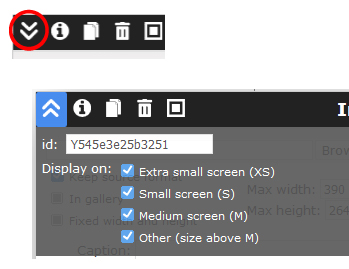
Any element can be made not visible on some screen categories (XS, S, M, L).
Reduced menu
A menu made invisible on some screen categories (XS, S, M, L), will be displayed as a reduced menu. A click unfold it on the full screen width.
Elements width
The elements are rectangular and generally occupy the full width available in the cell. By default texts are fluid and images are flexible. Some of them can have a fixed width, such as images or blocks.
Change the width of the browser window or rotate your device >>>
Heights
Cell height
The height of the cells is determined by the browser, based on the content and available space. The main cell occupies the entire window, even if the content is smaller. Depending on the browser it can reveal differences in relative heights, especially visible between Chrome and Firefox.
Full height block
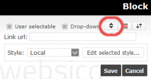
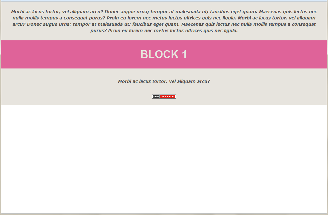
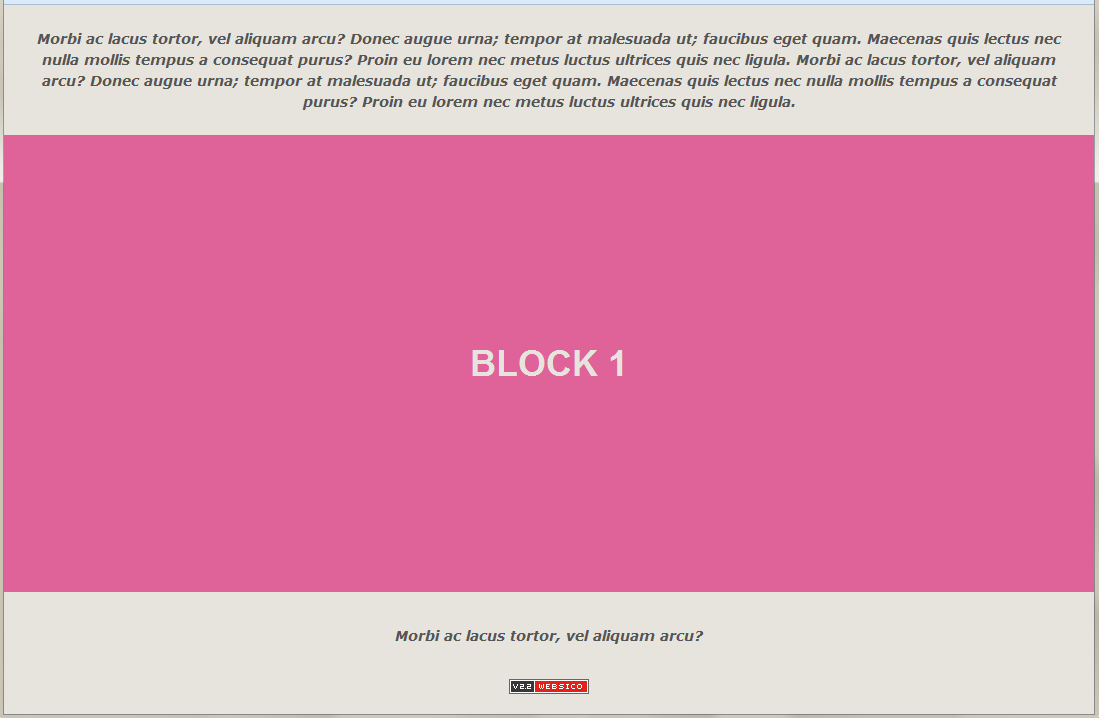
The height of a block can be set so as to fill the full height in the cell that contains it, the other elements then being pushed up or down. Several blocks in the same cell can share the height of the cell, with no space between them except the margins value.
Bubble block
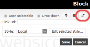
If a block has a lower height than its container column, it can be made 'bubble' to be seen during a vertical page scrolling.
I'M A BUBBLE BLOCK
Please scroll page vertically to see my behaviour


